Work

Airveda

A research-led brand language for Airveda, a company whose devices and apps make air-quality data accessible and accurate so people can act on it. I built the brand from who they are outward: a defining archetype, its voice, typography, an accessible colour and gradient system, and finally the mark itself.

Client
Airveda, air quality
Discipline
Brand strategy and identity
Archetype
The Sage: guardian plus guidance
Year
2022
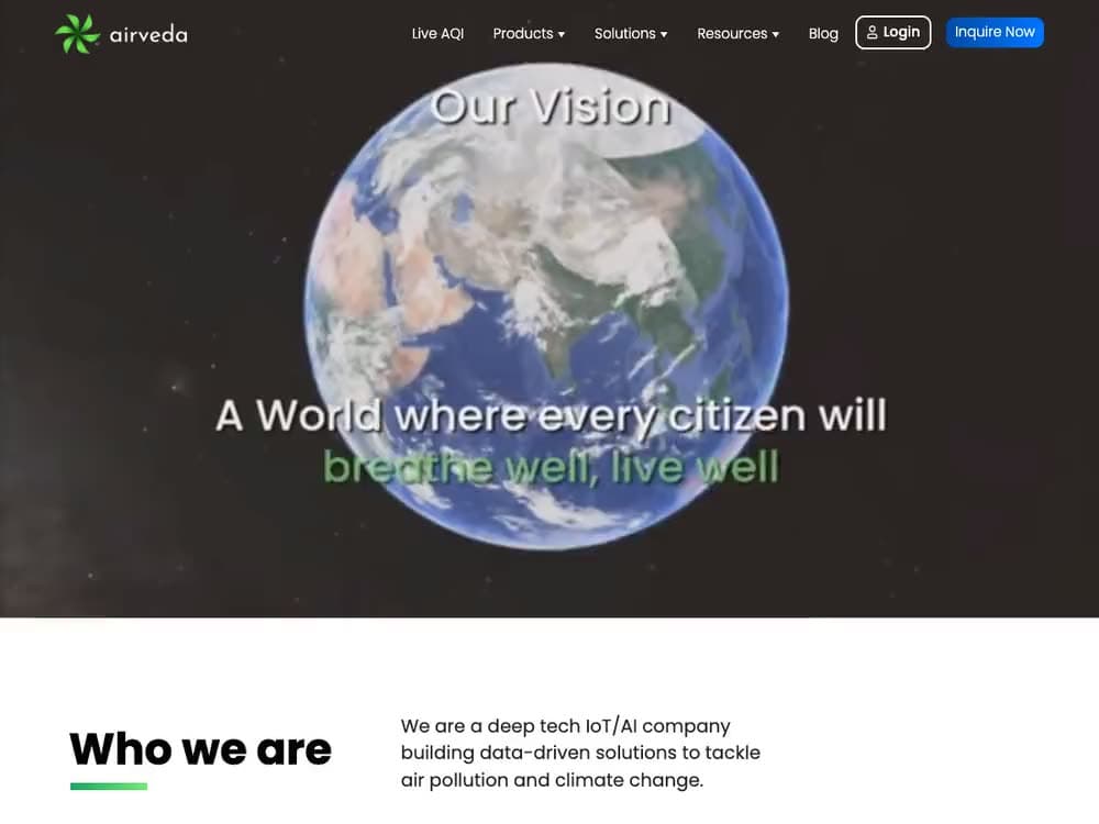
The Airveda brand language in the wild: the vision statement, mission pillars and accessible colour system on the live site

Strategy before visuals

This was a strategy exercise before a visual one. I started from a defining archetype, the Sage, guardian plus guidance, and worked outward through its characteristics and voice into type, colour and form.

Every decision, from the archetype wheel to the final logo, was documented in a research deck that carries the thinking behind it. Nothing trimmed.
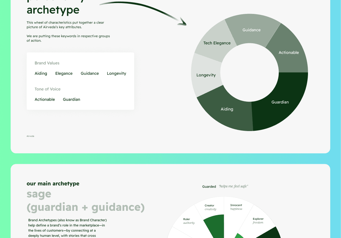
Airveda's defining archetype, the Sage, and the characteristics that flow from it
The Sage archetype, guardian plus guidance, set the voice before a single visual.

Accessible by design

Because Airveda's whole purpose is making air-quality data legible, the colour and gradient system was built to be accessible from the start, so the brand could carry data as clearly as it carries identity.
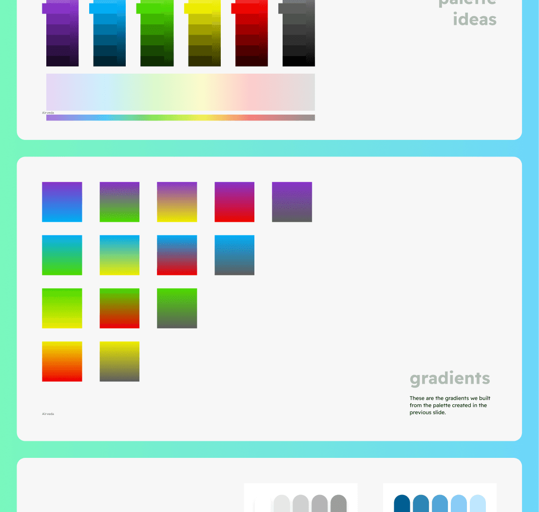
The Airveda colour and gradient system, built for accessible data display
An accessible colour and gradient system, so identity and data stay legible together.
Good branding is a set of decisions, not a set of decorations. I start from who the brand is, then make type, colour and form earn their place.

Next project

tl;dv