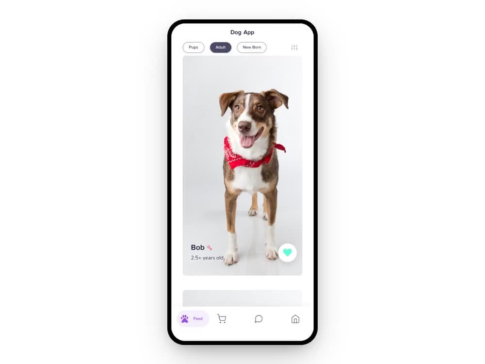
The challenge
Adopting a dog online usually means scrolling a spreadsheet dressed up as a listing page. The brief was to make it feel less like filtering inventory and more like meeting the right dog, warm from the very first screen.
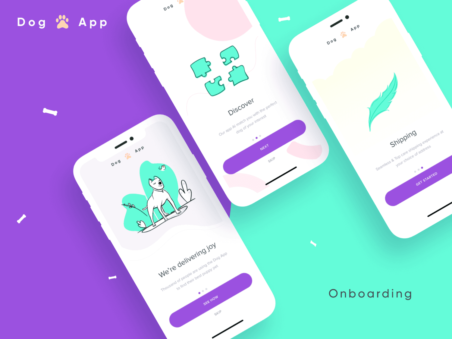
That meant the illustration language, the colour, the tone of the copy, all had to carry personality before a user ever saw a real dog's photo.
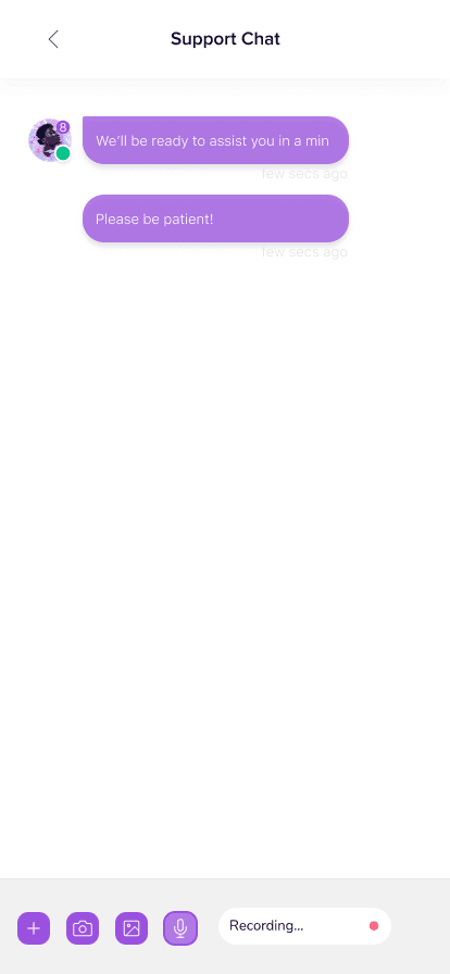
Beyond the adopt button
Adoption is the headline moment, but it isn't the whole app. Once someone brings a dog home, they need food, gear and a way to ask questions, so the app carried through into an in-app store and support chat rather than stopping at the match.
Designing that meant extending the same warm, rounded visual language into commerce and support without it feeling like a bolted-on afterthought.
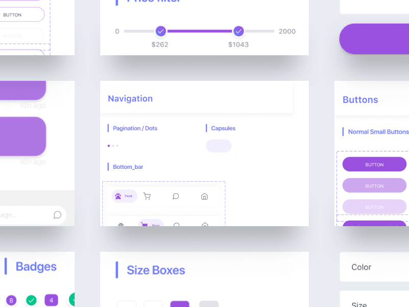
A system built to last
Buttons, badges, navigation patterns, size boxes, colour, all documented so the visual language could survive beyond a single release, and beyond a single designer.
It has: the company has iterated on the product many times since 2020, and the purple-and-mint colour system has stayed exactly where I left it.
The clearest sign a design system worked isn't a style guide nobody opens again, it's a colour scheme that's still standing years and many iterations later.