The biggest challenge
This was the first time I'd designed for a data science platform, a field I knew very little about. Every Jira ticket or research doc sent me straight to my product manager, Avinash, to translate the jargon. The team gave me the time to actually learn: I spent close to a week going through Domino's own in-house university course before I felt steady.
It got easier after that, but every day still added a new chapter to how much I understood about how data science teams actually work. The field is far more complex than it looks from a Forbes headline.
Working around a live, growing product
The product was already in the hands of real customers, running on an existing design language. Whatever UX problems I found, there was rarely a quick stop-the-world fix. The team was small, and the engineers available to implement changes were already stretched thin keeping the platform steady.
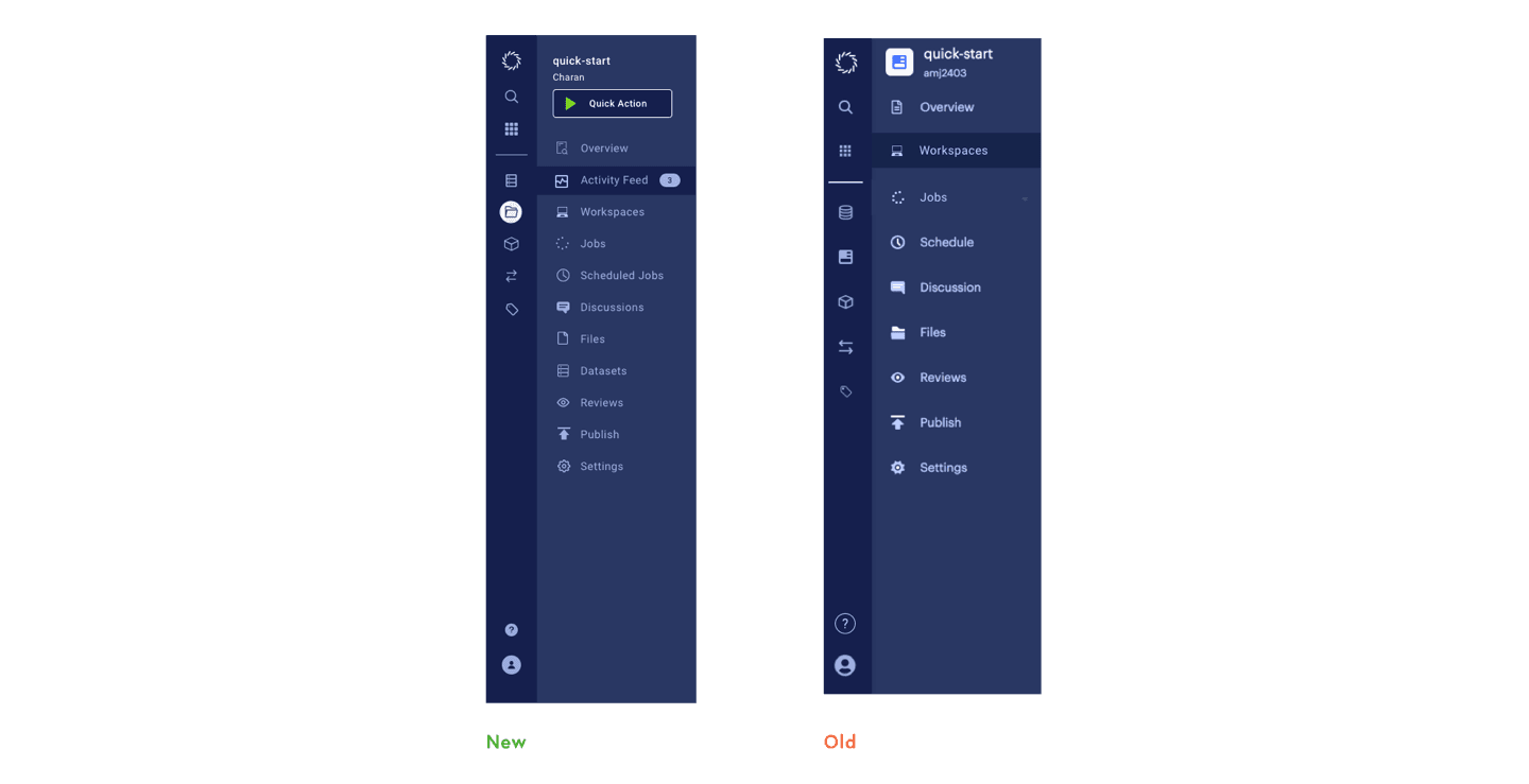
Some of what shipped during this period still shows it: differences in icon weight, contrast that isn't quite right, a left navigation bar that looks different from screen to screen depending on when it was last touched. Those aren't oversights, they're the visible cost of shipping around a system already in production.
Mapping the whole investment
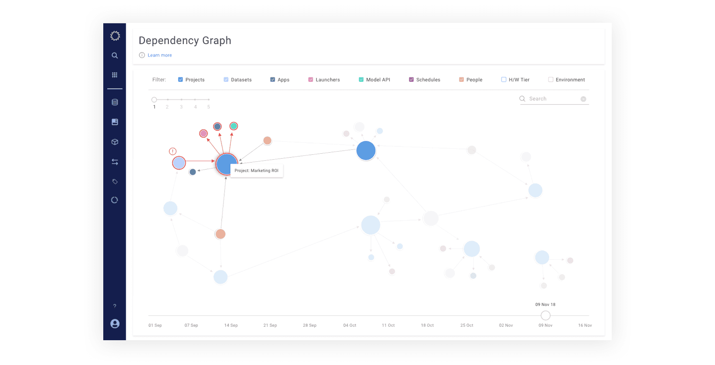
Teams needed a way to see, at a glance, what the company had actually invested in across projects: people, compute, datasets, models. The Dependency Graph maps every one of those parameters into a single explorable view instead of a dozen disconnected reports.
One workflow instead of five Jira boards
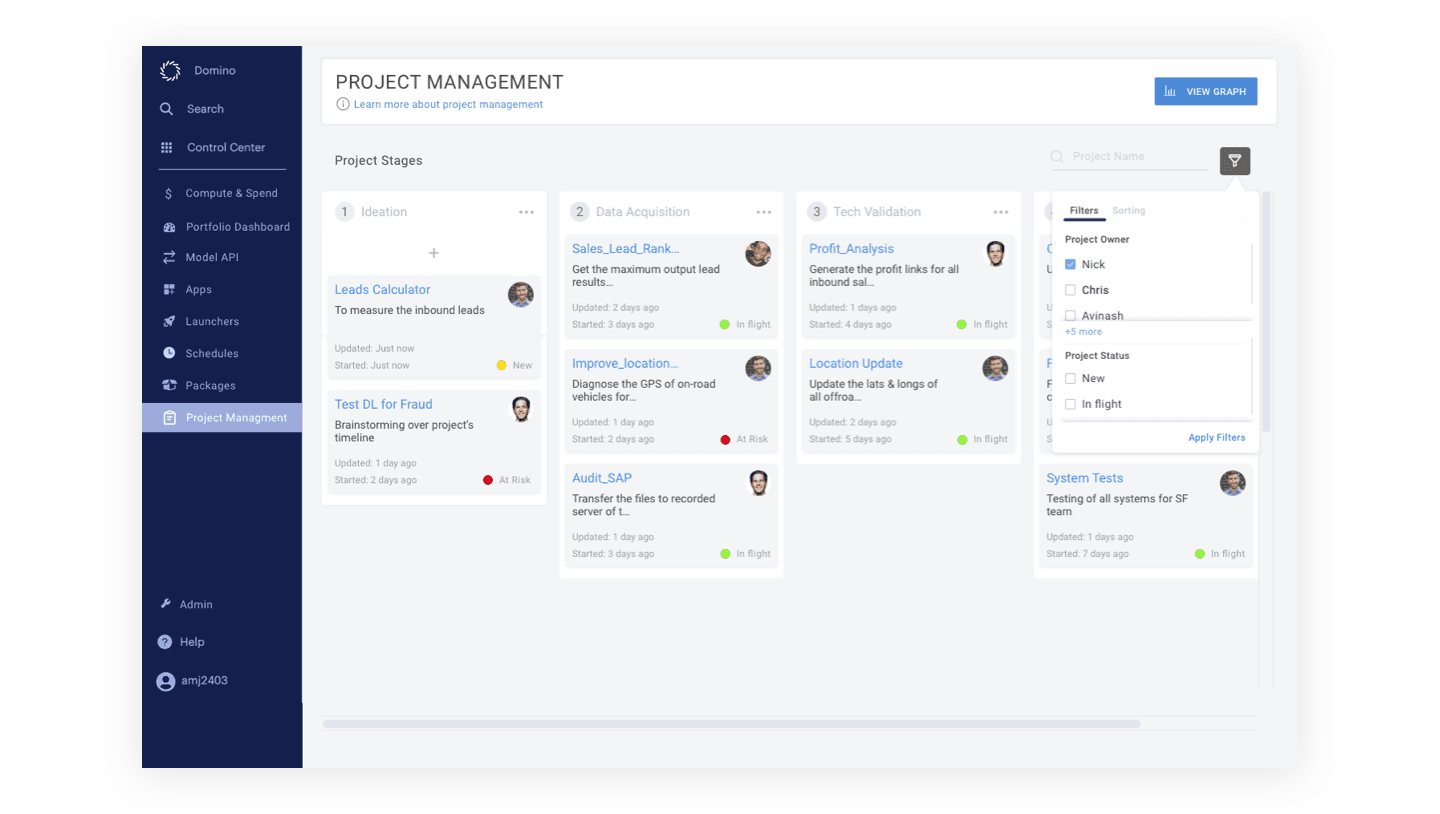
Data science work was defaulting to Jira, and getting lost there, mixed in with every other engineering effort the company was running. Project Management brought the full data science workflow onto one platform built for it, so a project's actual state was visible without archaeology.
A home for every package
Data scientists were managing packages across environments with no central view. This feature gave every package, Python or R, one place to live, filter and version, so a team could see what was installed where without asking around.
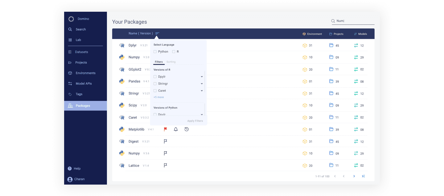
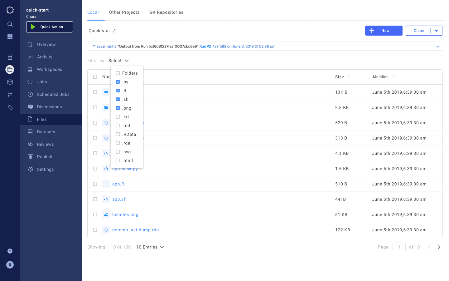
Designing the file manager from scratch
The file manager inside a project was built from the ground up, shaped directly by input from the customer success team and focus groups with real users rather than assumptions about how data scientists like to organise files.
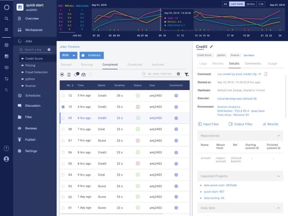
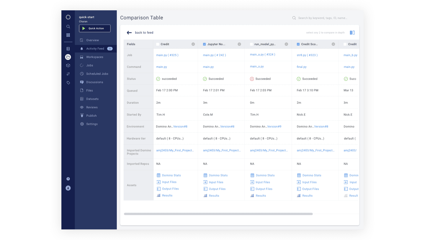
Comparing every run at a glance
The same research fed a jobs comparison table, letting a team line up every run of a project side by side, command, status, duration, who ran it, instead of opening each job on its own to piece the story together.
Setting the brand guidelines
Sales and marketing were pitching the same product with two different visual vocabularies. Seeing the cost of that mismatch, I set aside two sprints to define brand guidelines the whole team, not just design, could follow.
This project was my crash course into the data science world, and the real reward was seeing most of that work make it into the running product. People at companies like Honeywell and Bayer using features I shaped to solve real problems is a feeling that's hard to beat. The team went on to tackle a proper design system for the whole organisation next, which is a case study of its own.