Setting the vision
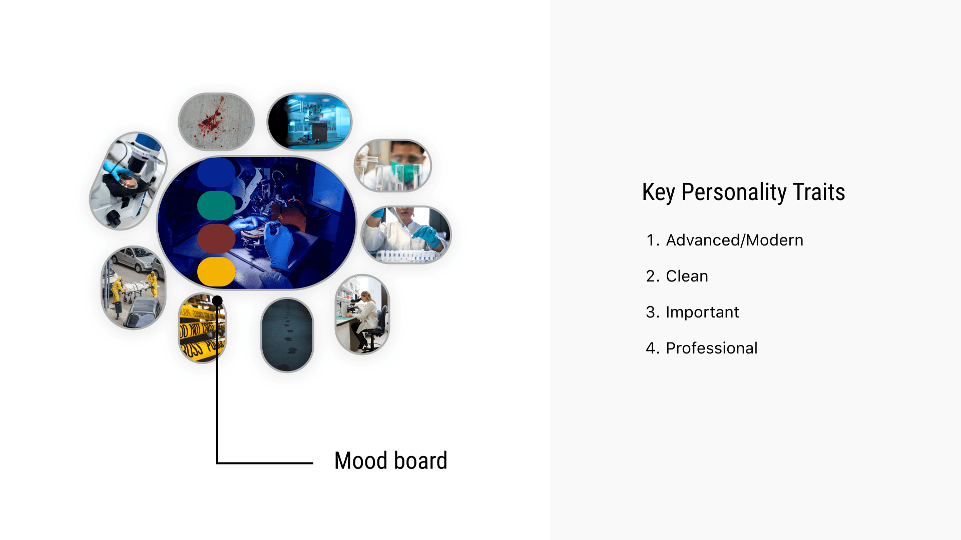
Before any design system could exist, the product needed a personality. That took two to three days of mood board research and back-and-forth with stakeholders, working toward a set of traits the whole platform would need to earn: advanced and modern, clean, important, professional.
Handling case data this sensitive meant the interface couldn't feel like a generic internal tool. It had to read as something built for the weight of the work.
Choosing typesets
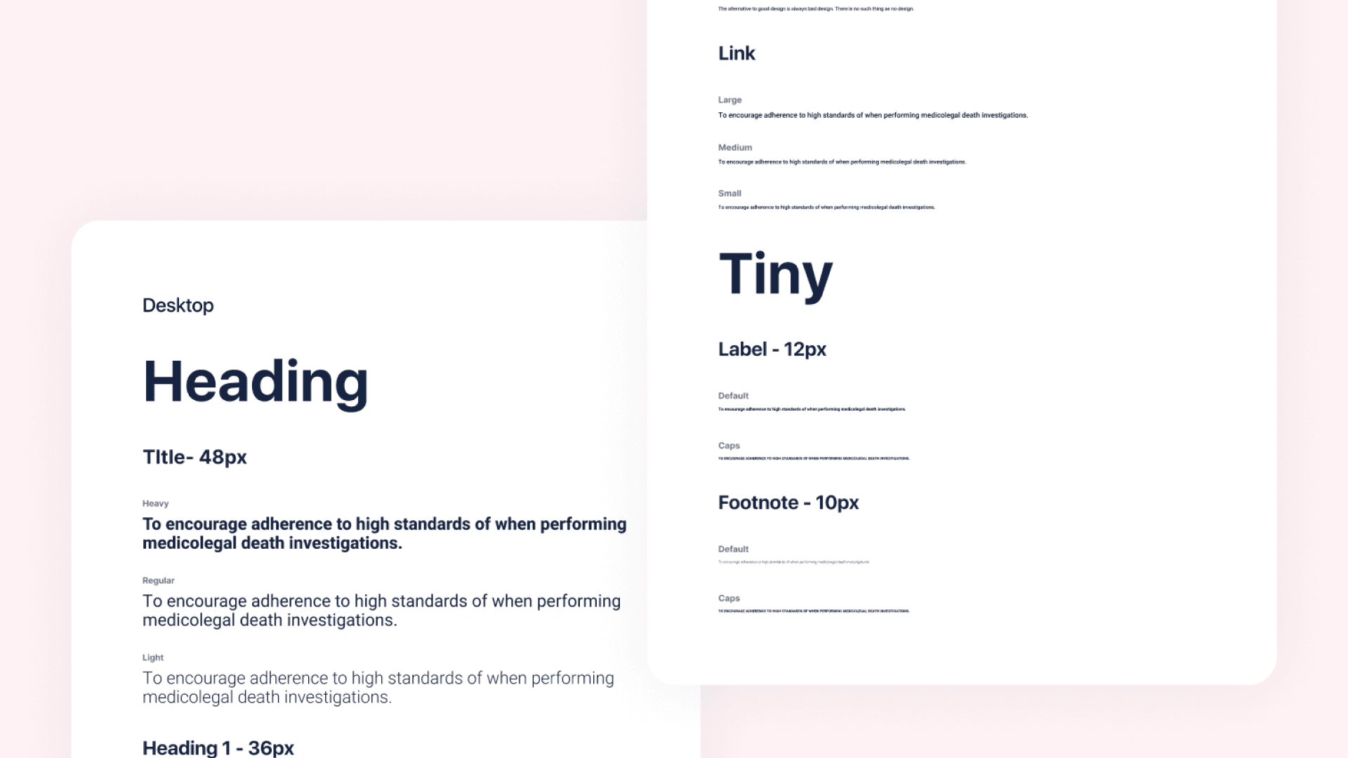
Modern and clean meant sans-serif, but the harder requirement was legibility across a wide range of sizes and fast cross-browser loading, since this was a platform people would read dense case data in all day. Muli, Roboto, Proxima Nova, SF Pro Text and Graphik all made the shortlist.
The final call came down to details most people never consciously notice: x-height, stress, how a typeface holds up at 12px versus 48px. Roboto, paired with Roboto Condensed, won out for body copy, with Source Code Pro reserved for anything that needed a monospace treatment.
Building the grid
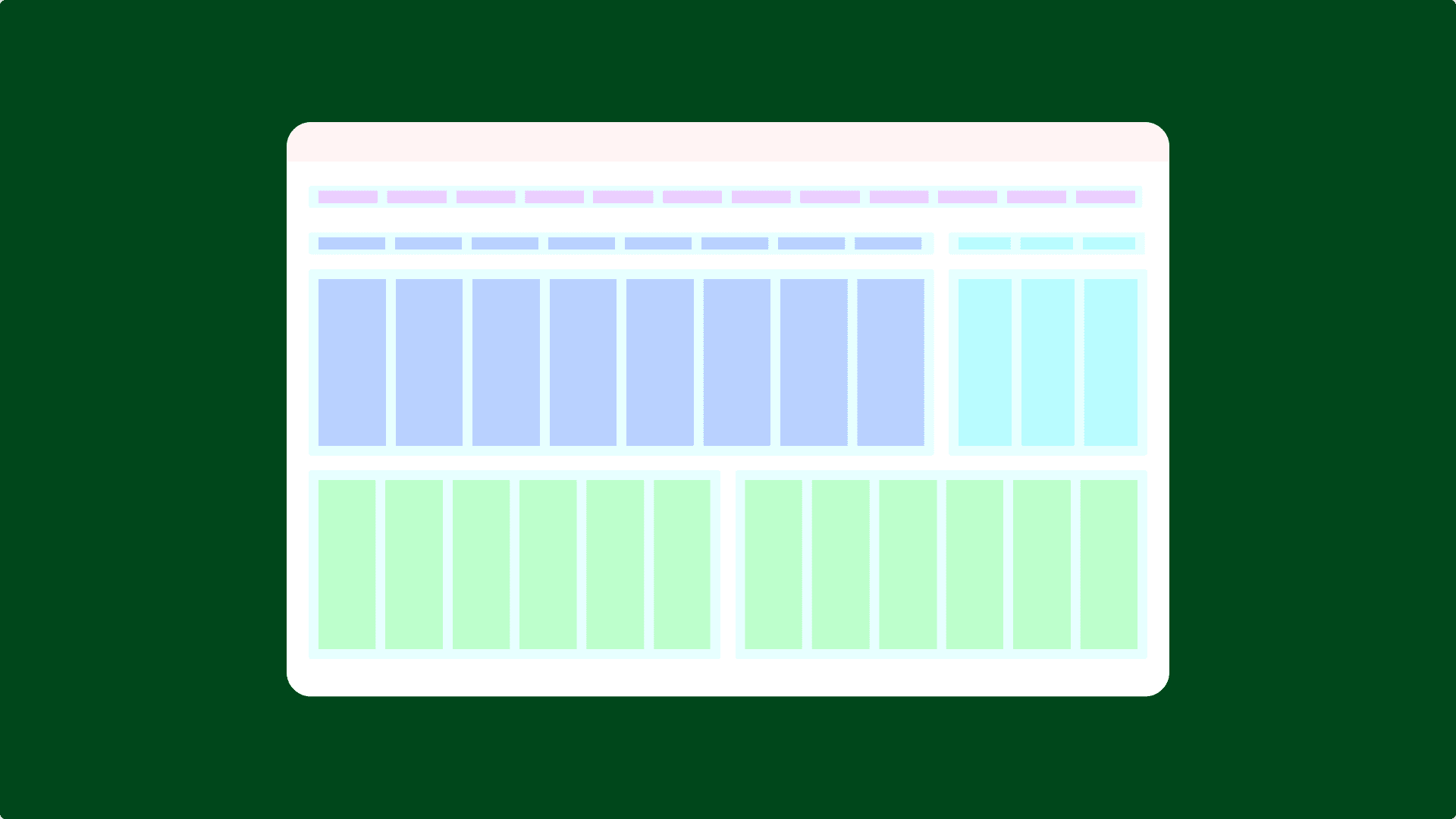
A case file carries dozens of structured fields: dates, jurisdictions, tags, examiner notes. None of that stays legible without a column system disciplined enough to keep tables, forms and calendars aligned at every breakpoint. I set that grid up for the platform's main frame first, so every screen built after it inherited the same structure instead of improvising its own.
Locking the colour system
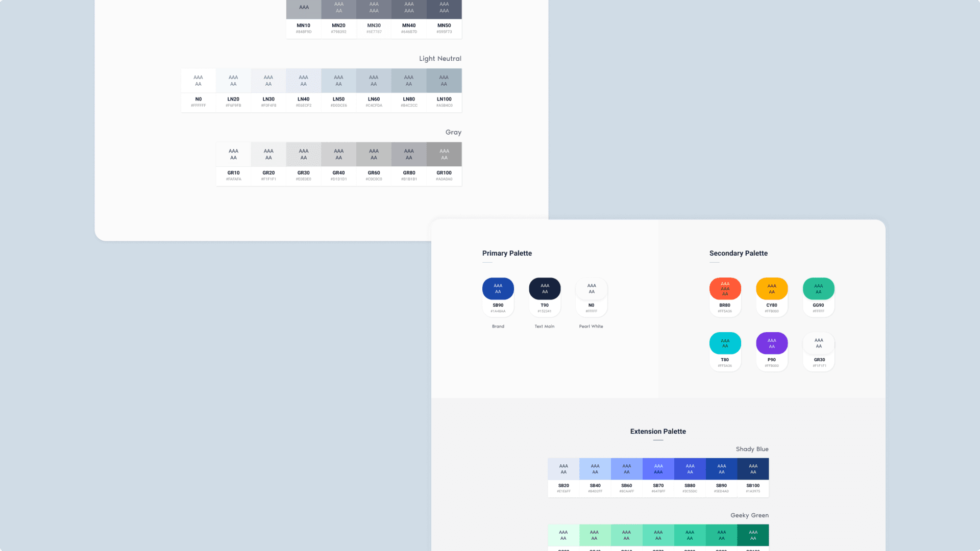
A primary palette carried the brand blue, a near-black for text and pearl white for surfaces. A secondary palette added colour for status and category, orange, amber, green, teal, purple, grey, and an extension palette gave data views their own tints without borrowing from the core brand colours.
Meeting accessibility standards
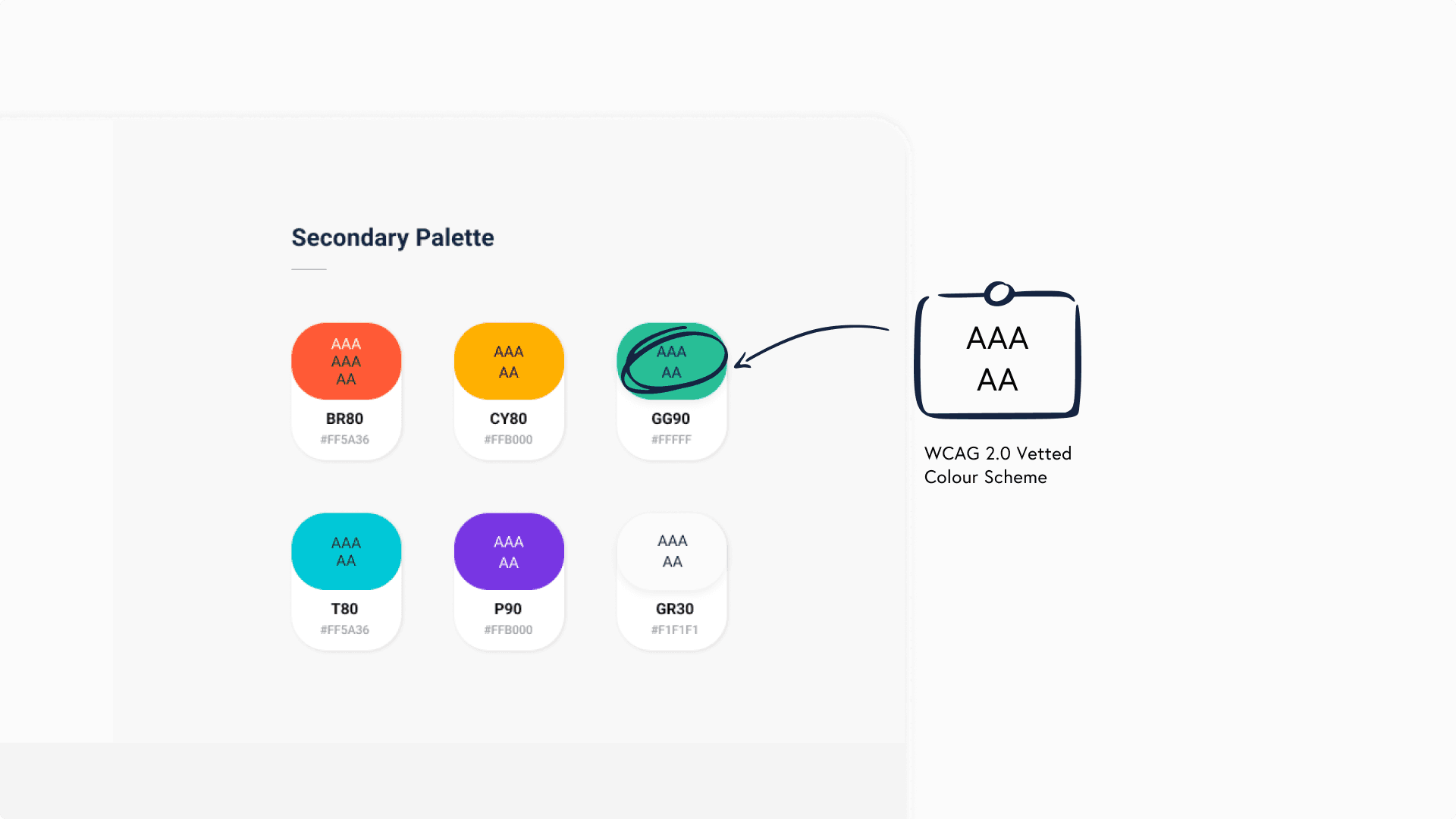
Every colour pairing in the system was checked against WCAG 2.0 and tagged with its contrast rating, AAA or AA, directly on the swatch. Engineers building a new screen could see at a glance which combinations were safe to use instead of guessing or shipping something that failed contrast later.
Icon components
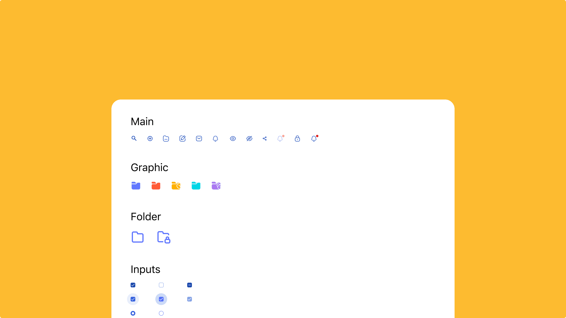
Icons were built as reusable components rather than one-off SVGs, grouped by where they'd actually be used: main navigation actions, graphic and folder categories, form inputs. Standardising stroke weight and sizing across all of it meant a new icon could be added later without breaking the set.
Tokens and primitives
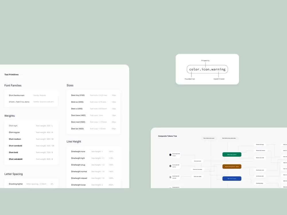
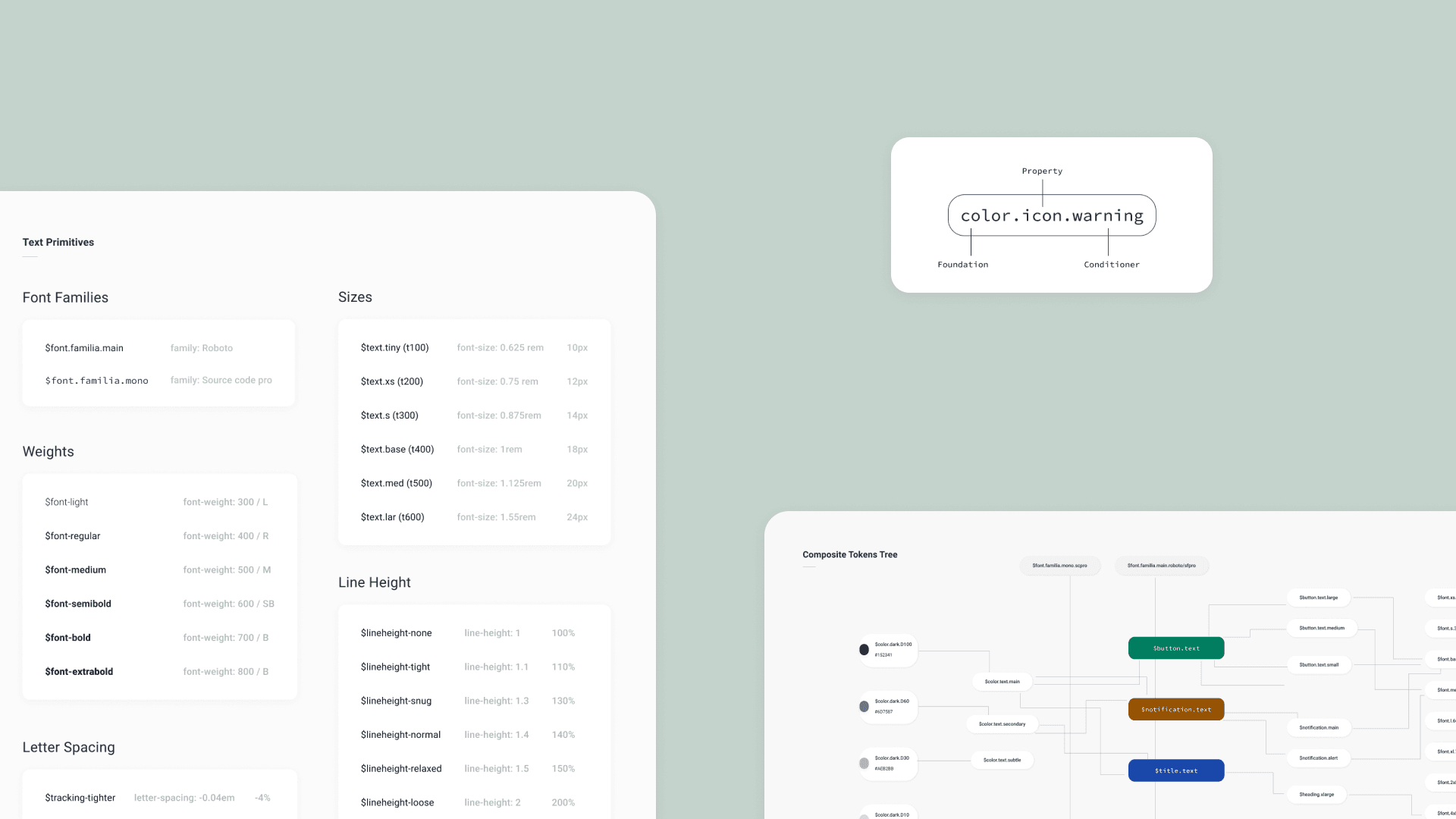
Text primitives, font family, weight, size, line height, tracking, rolled up into composite tokens that carried both a raw value and its semantic use, so a token like button text or notification text stayed consistent everywhere it appeared instead of drifting screen to screen.
ABMDI shipped with a full design system underneath it, vision through tokens through the actual case-management screens, built solo. From what I understand, funding for the platform dried up roughly a year after launch and it never got the reach it deserved. I don't have full visibility into what happened after that, whether it's been picked back up or shelved for good, but the system itself remains one of the more complete ones I've built end to end on my own.