Meeting Ria
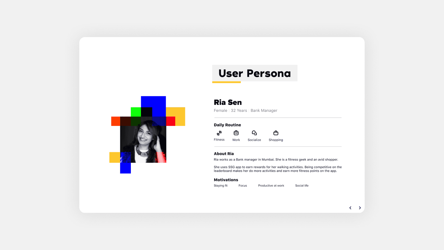
Ria is a 32-year-old bank manager in Mumbai, a fitness geek and an avid shopper, juggling fitness, work, socialising and shopping in whatever order the day allows. She uses StepSetGo to earn rewards for her walking activity, and the leaderboard is doing exactly what it's supposed to: being competitive on it pushes her to log more activity and earn more fitness points.
Her motivations were the brief in miniature: staying fit, staying focused, being productive at work, keeping a social life going. The homepage had to serve all four without asking for much attention.
The problem, and the goal
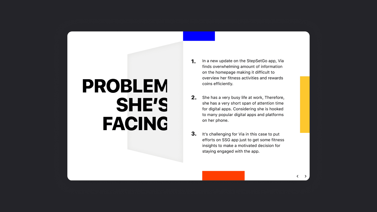
On a recent update, Ria found the homepage overwhelming: too much information to overview her activities and reward coins efficiently. She has a short attention span for any one app, already hooked on several others, which made it genuinely hard for her to stay motivated enough to keep engaging with StepSetGo for fitness insights alone.
The goal we set was deliberately narrow: enable Ria to easily see and track the progress of her fitness routine, plus her reward coins. Nothing else got to compete with that on the homepage.
Where it actually hurt
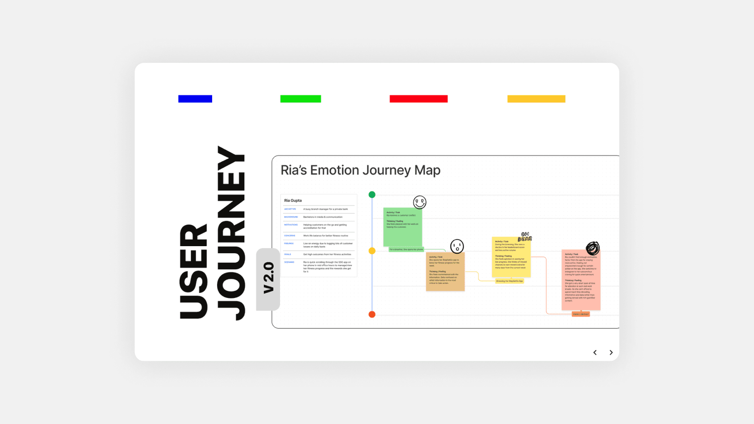
Empathising with Ria meant mapping her pain, not just naming it: she found the first fold overwhelming, too much data made it hard to find what she was looking for, and with every element given roughly equal visual weight, she couldn't tell which action she was actually supposed to take.
I laid that out as an emotion journey, first on paper, then as a digital map tracing how Ria's mood moves through a session: starting neutral as she opens the app to check her progress, dipping as she runs into too many competing pieces of information, and souring by the time she has to decide what to do next.
Testing the current app
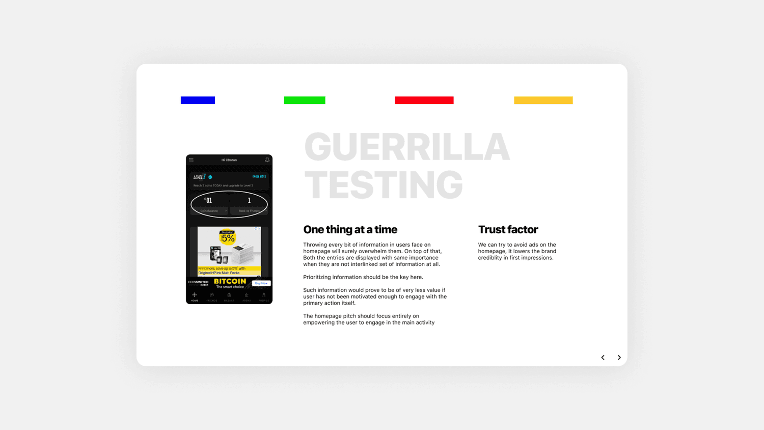
To check the persona against reality, I ran guerrilla testing directly on the live StepSetGo homepage. The homepage lacked visual hierarchy: every module held the same visual weight while scrolling, so nothing stood out enough to scan quickly. One module split into three actionable items pointing at the same destination, adding cognitive load (Hick's Law) for no real benefit.
Two smaller insights stuck: leading with a row of visible zeros before any real number lands as discouraging rather than motivating, and an ad banner sitting on the homepage was quietly costing the app trust and credibility on first impression. The fix in both cases was the same discipline: one thing at a time, prioritised, before anything competes for it.
Sizing up the competition
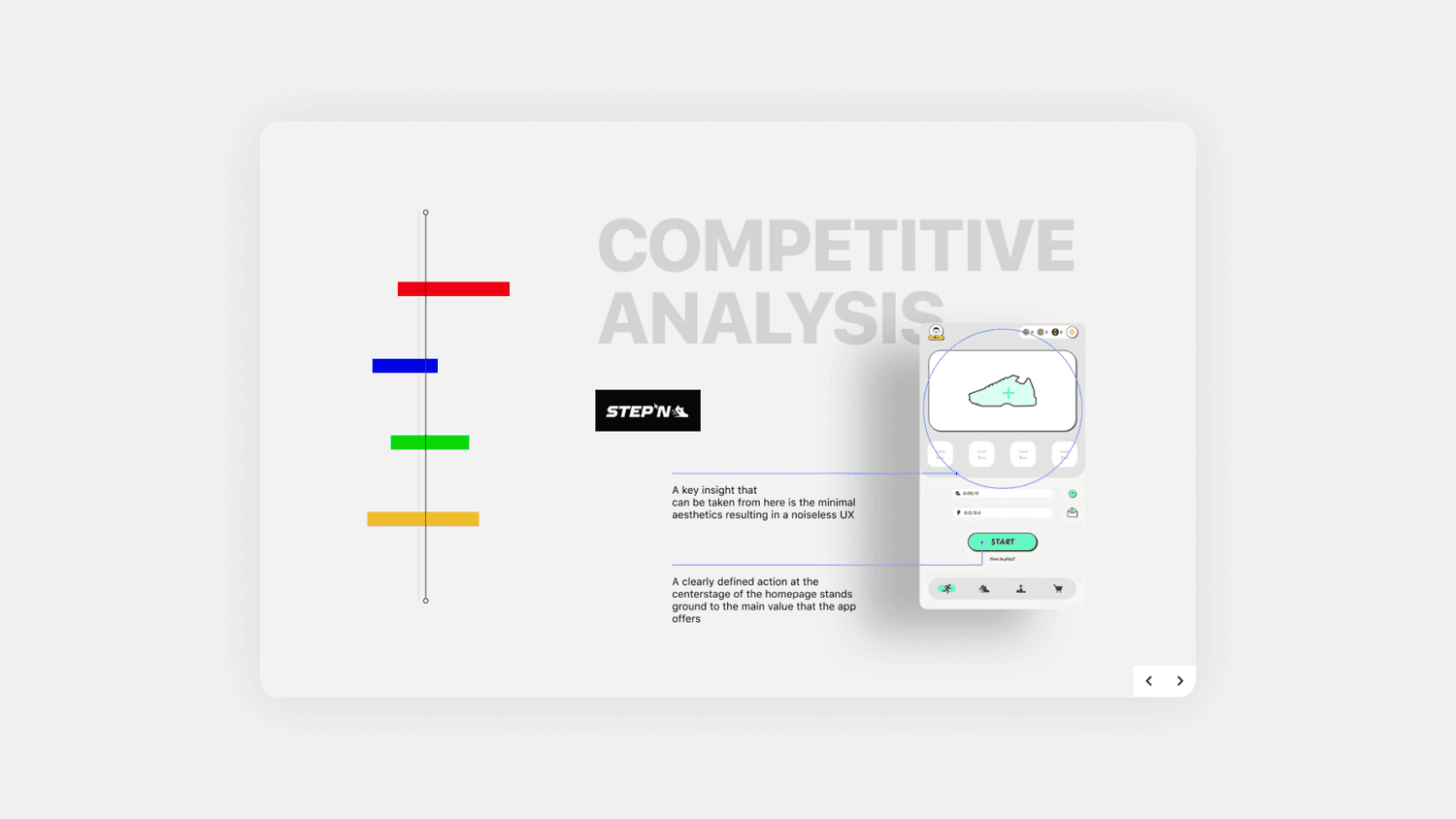
Two products were already doing walk-to-earn well: STEP'N and Sweatcoin. STEP'N's homepage worked because of what it left out, minimal aesthetics resulting in a noiseless UX, with one clearly defined action anchored at the centre of the screen carrying the entire value proposition.
Sweatcoin's wallet, by contrast, stayed deliberately secondary, since it's a reward, not the point, and its iconography leaned on universal, familiar shapes rather than clever ones. Both insights argued for the same thing: let one action lead, and don't make people relearn the interface to find it.
Setting the strategy
The rebuild had to hold itself accountable on two fronts: useful, meaning sensitive data stays safe and secure and content stays short, informative and engaging, and usable, meaning every task flow supports the user's goal, responds quickly, and gives each task a clear, single focus.
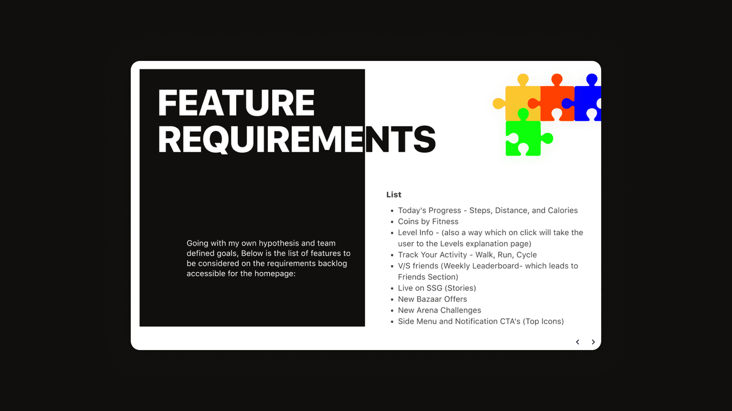
From there the homepage backlog took shape: today's progress across steps, distance and calories, coins by fitness, level info, activity tracking for walk, run and cycle, a weekly leaderboard against friends, live SSG stories, new Bazaar offers, new Arena challenges, and the side menu and notification CTAs. Two constraints kept the timeline honest: design for iOS only, since Ria is an iPhone user, and no wearable sync, since Ria can't connect an active wearable to the app.
From paper to pixels
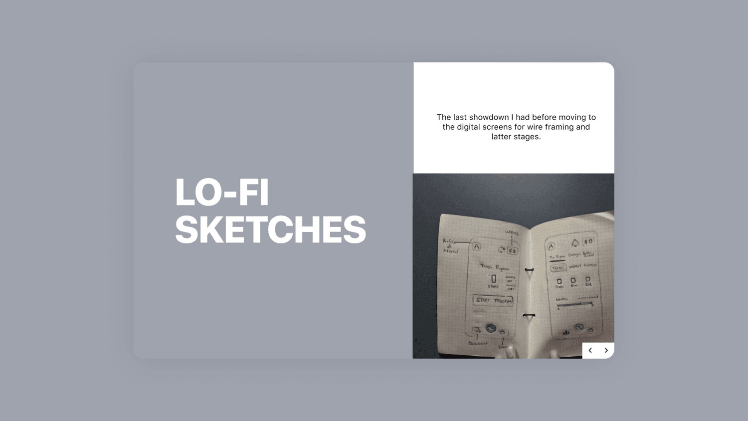
Before touching a digital screen, I sketched every plausible path Ria might take toward her goal, crossing out the ones that didn't hold up, including a couple built on the assumption she'd want to sync an Apple Watch, which the iOS-only, no-wearables constraint had already ruled out.
Those paper sketches were the last checkpoint before wireframing, a way to pressure-test the user stories, the feature list and the research insights against a real layout before any visual design began.
Two directions before the final
The first visual direction centred the homepage on a single glowing circular progress ring, steps and coins orbiting one metric. It read more like a standalone fitness gauge than a StepSetGo homepage, disconnected from the social and competitive hooks, stories, challenges, the leaderboard, that the feature list actually called for.
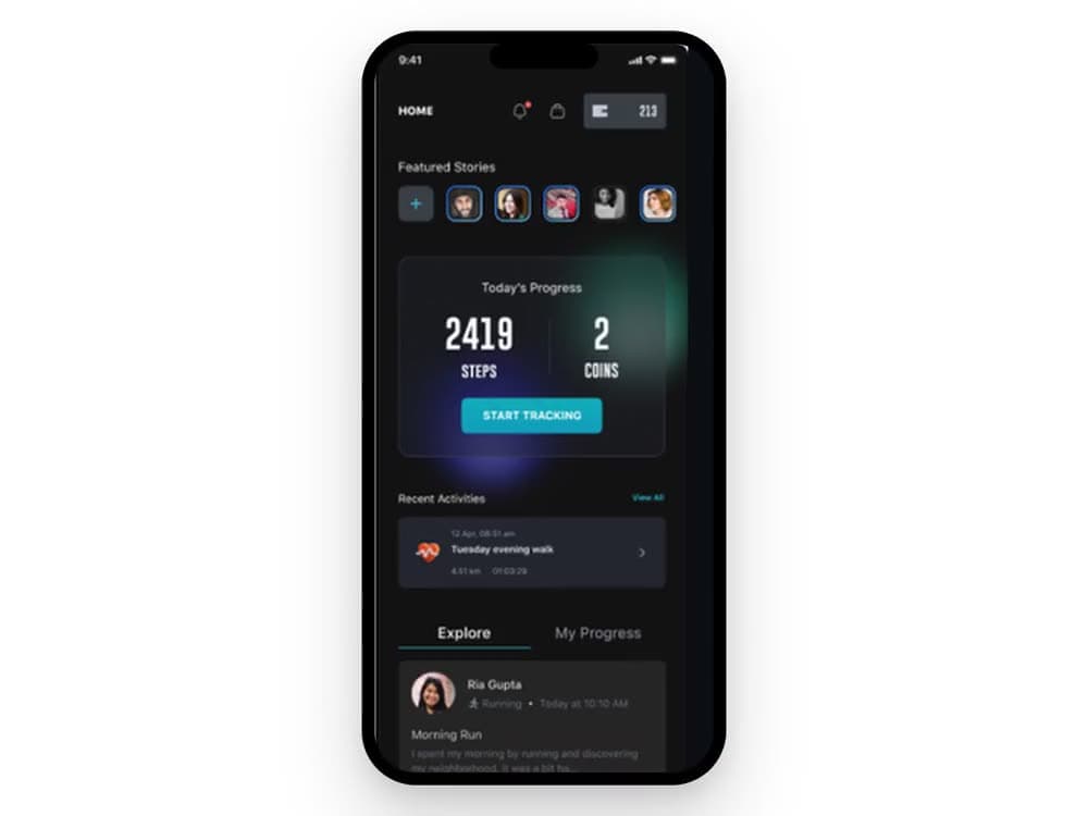
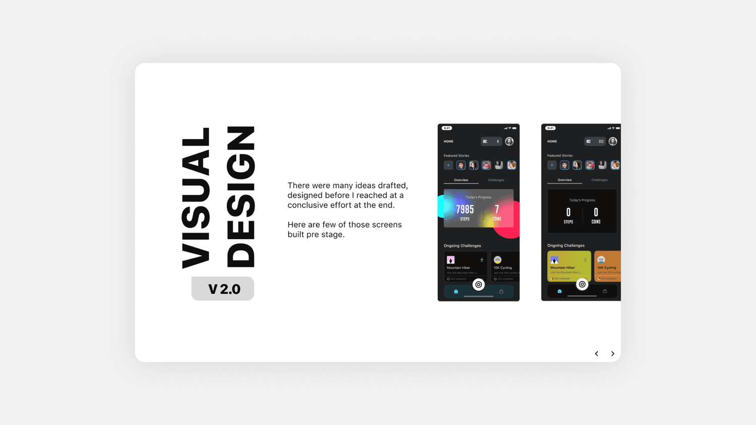
The second direction rebuilt around a feed instead: featured stories up top, a steps-and-coins card beneath, ongoing challenges under that. It was a closer match to what the research had actually asked for, and it's what the final homepage grew out of.
As the contract designer on this one, the number that mattered came after launch: user retention and daily engagement both moved up once the homepage shipped. Giving Ria one thing to focus on, instead of everything at once, turned out to be the whole redesign.