The problem
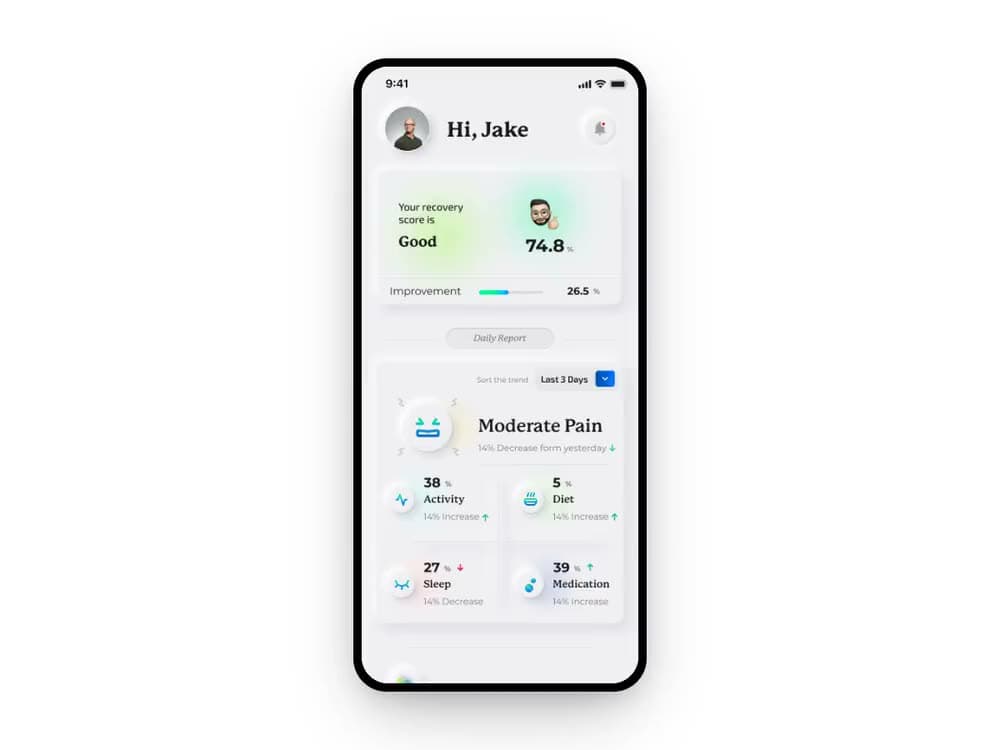
In the US, opioids account for roughly 75% of drug-abuse deaths, and post-operative recovery is a major on-ramp to dependency. Almost no modern technology addressed prevention during the recovery window itself. Recovry wanted app-based Cognitive Behavioral Therapy to reduce post-op opioid dependency, and a path to FDA approval.
Research surfaced a two-sided breakdown. Patients lose contact with providers after discharge and move through recovery uninformed, which drives opioid overuse. Providers cannot monitor every patient daily and have little visibility into recovery outside emergencies.
Designing inside hard constraints
This was a regulated, high-stakes product, so the strategy was as much about judgment and safety as features. Human judgment stayed non-negotiable: automated drug management carries real risk, so the design kept clinicians in the loop instead of automating medical decisions.
FDA approval as a goal meant the therapy approach had to be objective and defensible. Sensitive areas like prescription provision and pain tracking were deliberately constrained, because they are subjective and high-risk.
Closing the loop, from the first scan
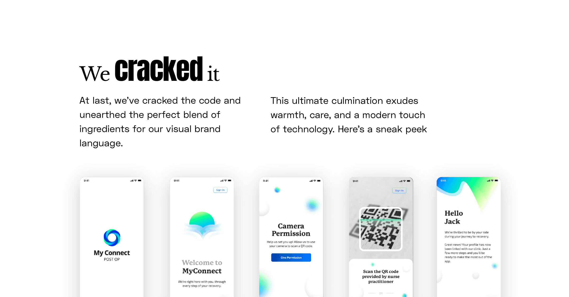
Onboarding has one job before anything else: link the patient to the clinic that just discharged them. A nurse practitioner hands over a QR code, the patient scans it, and the account is linked, no manual matching, no separate portal to log into first.
The app greets the patient by name and confirms the link immediately, before it asks for anything else. Leaving a hospital after surgery is disorienting; the first thing the product does is remove one more thing to figure out.
The AI product decisions
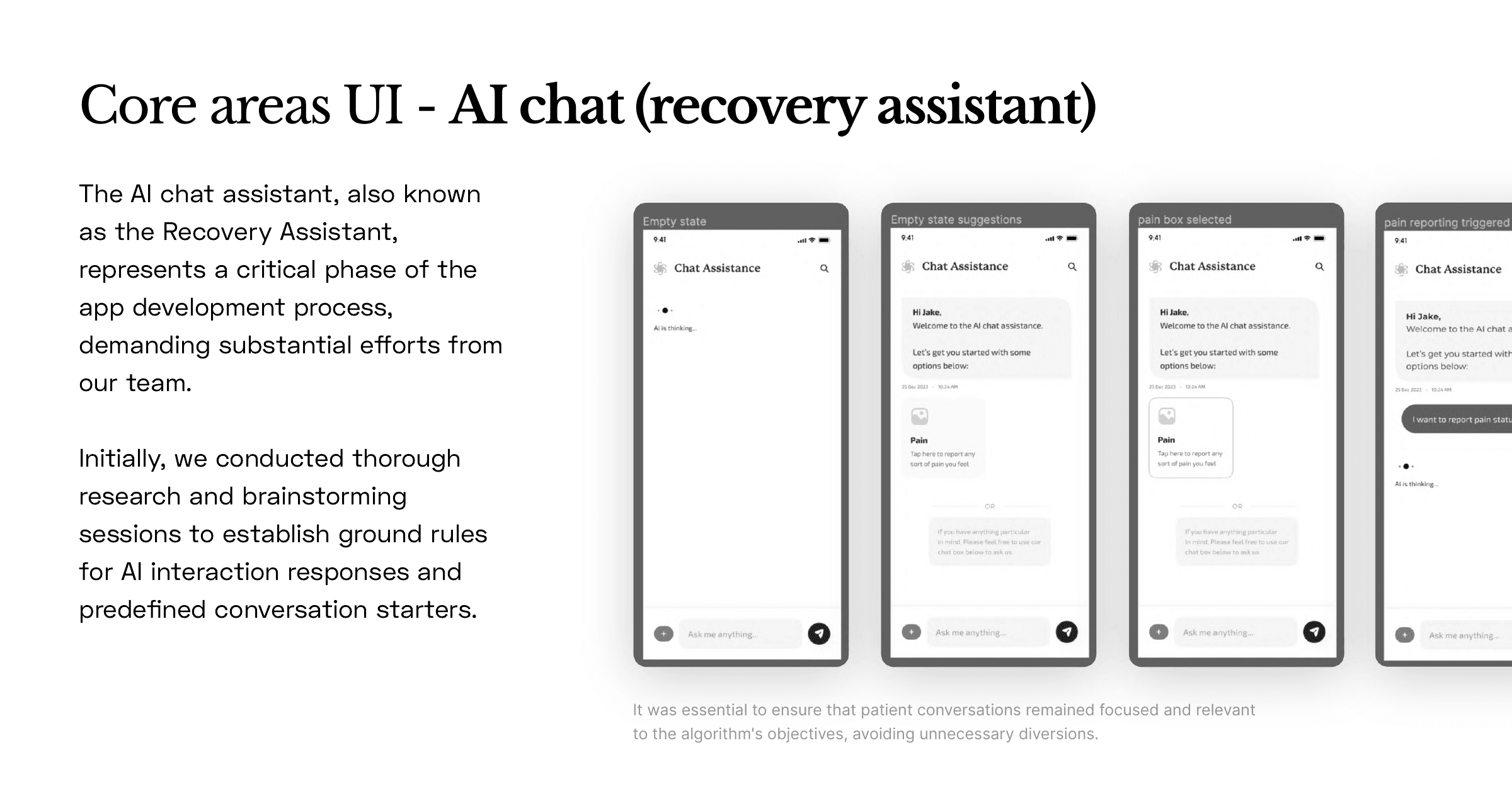
This is where the work was AI design, not AI decoration. I evaluated ChatGPT against Google Bard for the brief, then chose and tuned ChatGPT for a more humane, concise patient-assistance experience, a build-versus-tune call driven by the use case, not the hype.
I defined guardrails so the assistant operated within a confidence interval, with human-in-the-loop review and clear escalation. I researched FDA Software-as-a-Medical-Device rules alongside App Store and Open Health Stack guidelines, and worked with the client's attorney on the legal pipeline. Front-loading compliance cut risk and rework later in the build.
Meeting WCAG and HIPAA from day one
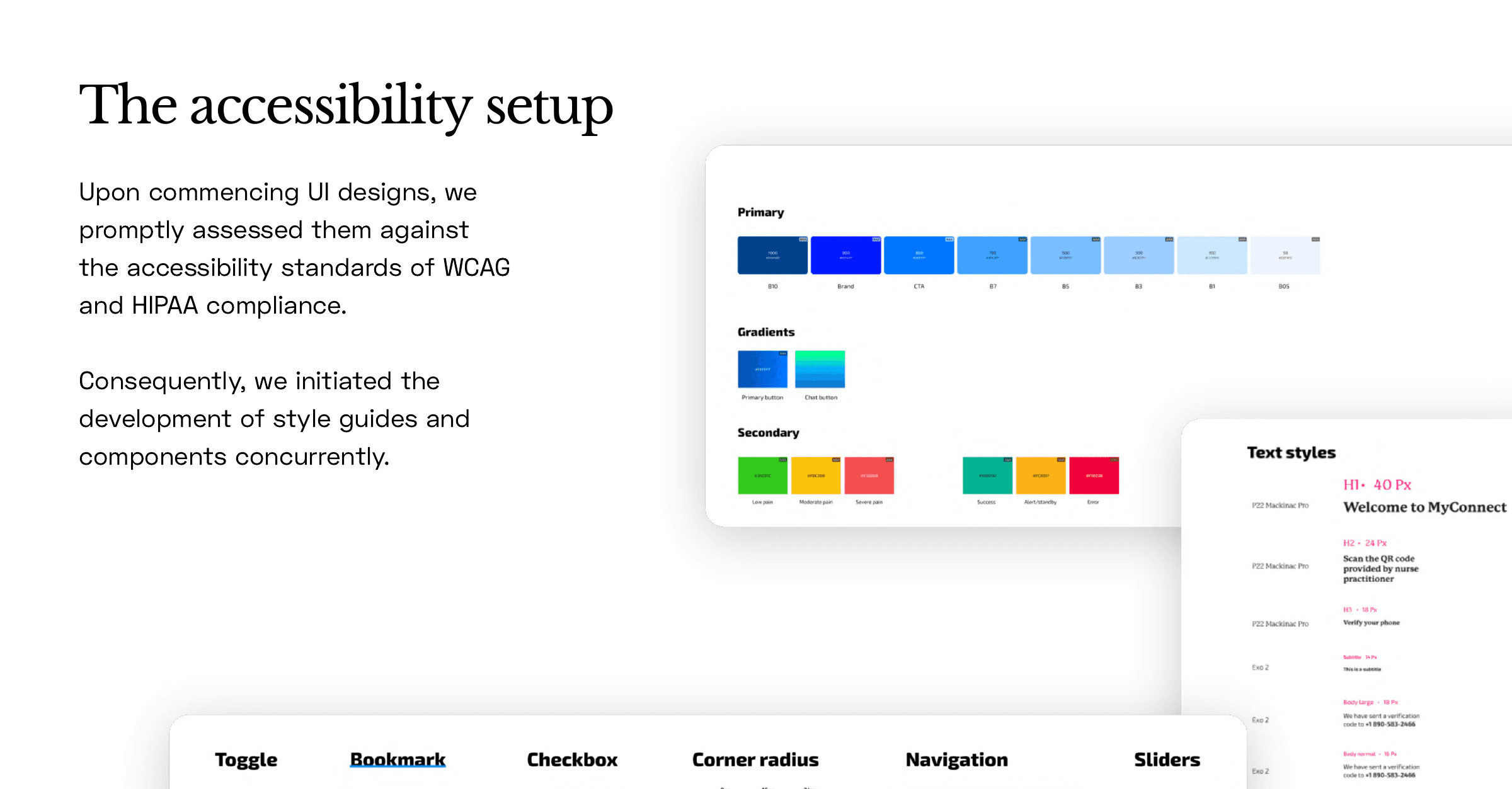
Every screen got checked against WCAG and HIPAA as it was designed, not audited afterward. Style guides and components were built alongside the UI itself, so compliance was a constraint the design worked inside of from the first screen, not a report card at the end.
The pain-severity palette is the clearest example: low, moderate and severe pain each carry their own colour, contrast-tested to stay accessible, so a provider scanning a patient list can read severity as a colour before reading a single number.
The outcome
We shipped the patient app, the provider apps, and the design system in a rigorous eight-month window: a compliant, human-in-the-loop AI product moving toward FDA approval, built by a small team where I owned design end to end and drove the AI product decisions.
The app entered production with an alpha rollout for the pilot, and major US healthcare players expressed interest.
I do not decorate AI products. I shape them: model choice, guardrails, compliance, and the UX that makes clinical AI trustworthy. And I ship.